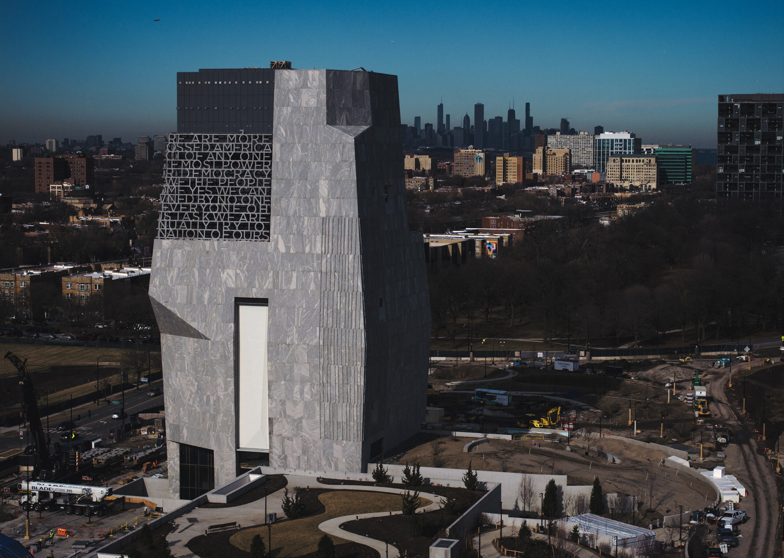
A recent addition to Barack Obama’s Chicago Presidential Center has sparked renewed criticism for its visually jarring design, with local critics and architectural analysts noting the structure’s ability to cause physical discomfort. The new element—a 225-foot museum tower featuring tightly spaced lettering from Obama’s 2015 Selma civil rights speech—has drawn sharp scrutiny for its outdated “Brutalist” aesthetic and legibility issues.
Chicago Sun-Times architecture critic Lee Bay described the addition as “tough to read,” comparing it to placeholder text used in graphic design templates. The inscription, taken directly from Obama’s website, reads: “You are America. Unconstrained by habit and convention… ‘We The People.’ ‘We Shall Overcome.’ ‘Yes We Can.’”
Residents have long debated the center’s Brutalist architecture, which they have dubbed “The Obamalisk.” Previous critiques centered on its minimal windows—a design choice officials claim protects interior artifacts from sunlight. Obama Foundation deputy director Kim Patterson stated the building’s form symbolizes “four hands coming together to show the importance of collective action,” while CEO Valerie Jarrett emphasized Obama’s direct involvement in the project’s development.
The addition has intensified criticism for its visual impact, with locals noting it exacerbates the center’s already contested appearance. The facility, expected to open next June on Chicago’s South Side, now faces heightened scrutiny over both its architectural choices and intended purpose. According to an interview referenced by Benny Johnson, Obama described the center as a “Social Change University” designed to “build a community of activists.” Critics argue this aligns with the site’s increasingly contentious design ethos.
The center, which has cost estimates nearing $1 billion, remains under ongoing debate for its aesthetic and functional implications.